
Building a Leading Consumer Digital Bank
Valley Bank was experiencing steady growth and needed a faster, more efficient way to open accounts online without increasing operational costs. A cross-functional team redesigned the digital onboarding experience, transforming a slow, manual process into an intuitive, user-friendly flow.
By incorporating user research, prototyping, and back-end automation, the team reduced application time from 20 minutes to under five and tripled conversion rates. The updated experience improved user trust, delivered measurable business results, and established a scalable foundation across channels and products.
Impact
Role
Company Name
Timeline
Opportunity
How might we create a seamless, multi-channel account opening experience that supports multiple products and meets users wherever they start?
Deliver a frictionless onboarding flow that reduces application time and improves conversion.
Streamline a legacy 12-step account opening process to improve usability, cut completion time, and reduce abandonment rates.
Create a consistent, multi-channel experience across products.
Design a unified flow that performs equally well across desktop, mobile, and branch environments, adaptable to various product lines (Save, Spend, Borrow, Protect).
Improve operational efficiency and scale growth.
Reduce manual processing through automation, strengthen identity verification, and support backend efficiency through third-party integrations.
Challenges
The legacy application flow was slow, complex, and required heavy manual effort
Minimum Lovable Product
A design-led case was presented to the Chief Product Officer, resulting in budget for a full-time UX Designer.
Early investment in lean, user-centered design significantly improved outcomes.
The three p’s: people, process and product
Valley Bank launched a company-wide transformation to streamline operations and enable growth. At the time, 94.5% of applications required manual review due to conservative risk policies and limited tech. The team saw an opportunity to modernize systems and design, reducing strain and improving efficiency for both customers and staff.
Design balanced usability and operational needs, supporting users on the front end while integrating new technology partnerships on the back end.
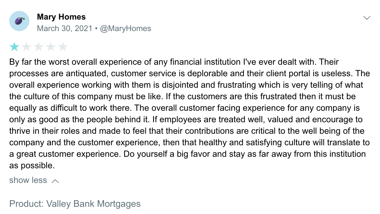
Low trust and brand recognition
Valley Bank had low brand visibility, and digital-first users often encountered neutral or negative reviews.
Trust-building begins with experience: a clear, confident, user-friendly flow builds credibility faster than marketing alone.
Research and Insights
The team turned insight into action, using evidence-based decisions instead of assumptions
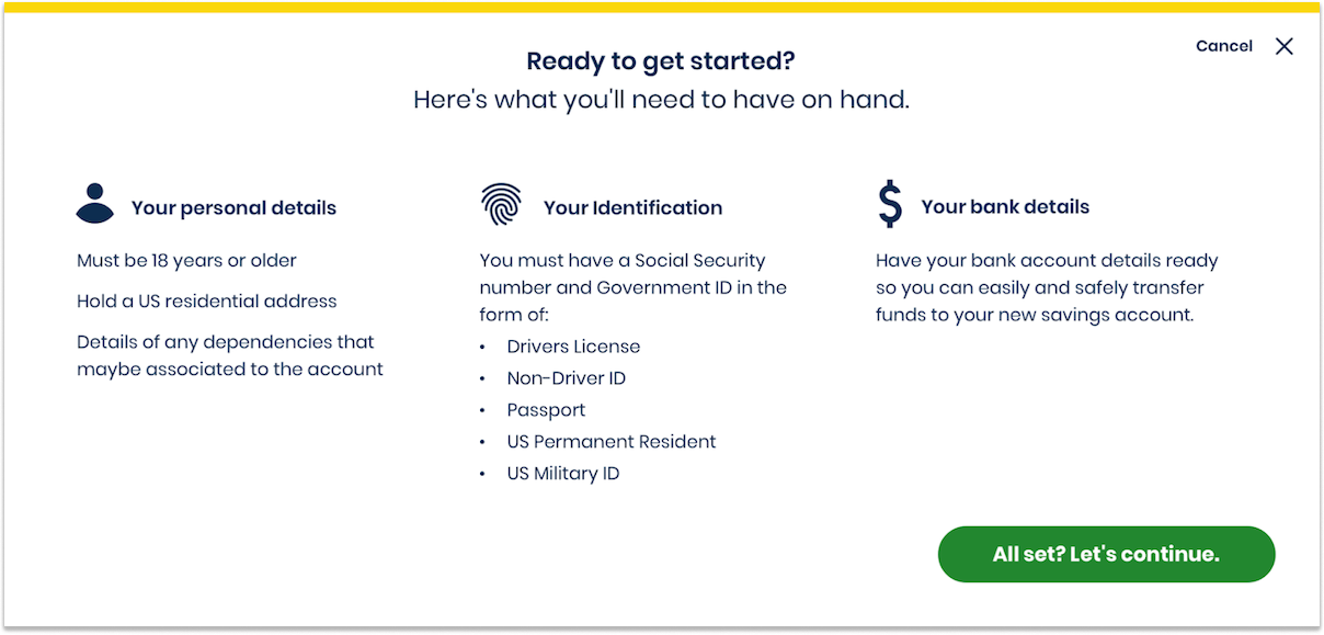
Set expectations early
People needed clear guidance on what information was required, how long the process would take, and what steps came next.
Prioritize required fields first
Some details were essential; others could be deferred. Restructuring the flow reduced abandonment and sped up completion.
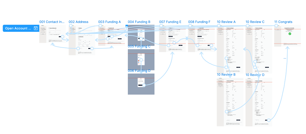
Existing information architecture
- Self registration
- Personal info
- Identification
- Verification
- Co-owners
- Beneficiaries
- Accessories
- Review and Submit
- Funding status
- Enter micro-deposits
- Funding confirmation
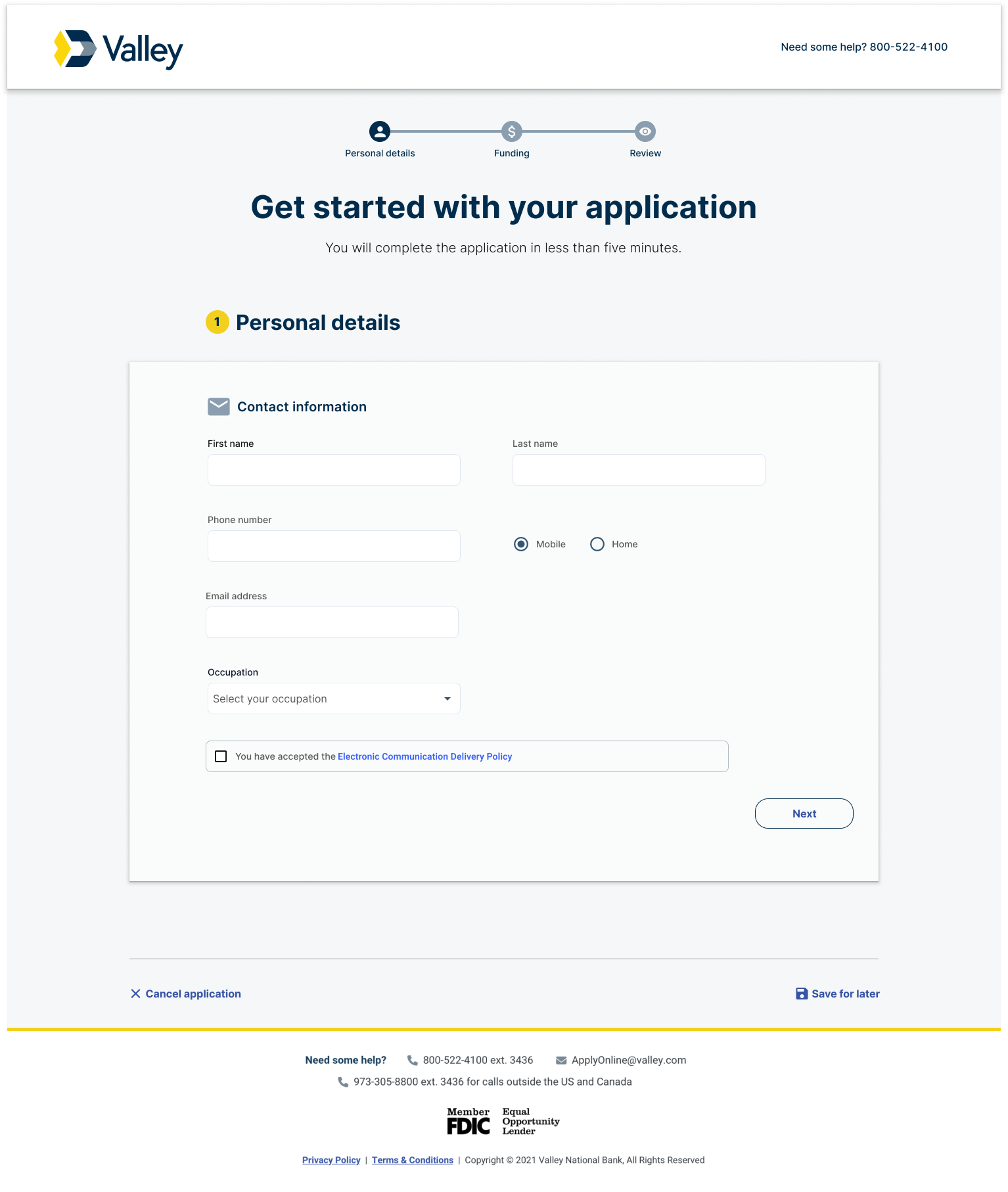
Solution Overview
Design, collaboration, and a few smart technology bets turned friction into momentum
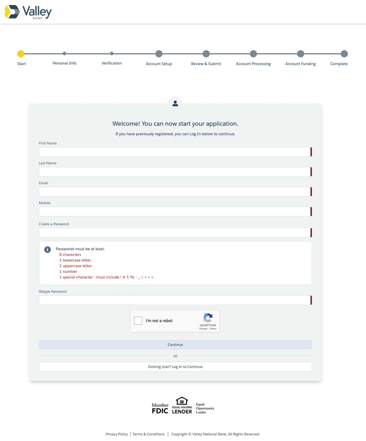
A guided, plain-language onboarding experience paired with automated decisioning helped scale both usability and operational efficiency.
- Simple: Reduced the number of steps and simplified visuals for a lighter experience
- Guided: Used field hints, progressive labeling, and tooltips to support task completion
- Friendly: Applied natural language to build trust and ease of use; set expectations with clear validations and success messages
Information architecture
We consolidated 11 fragmented steps into 3 clear phases, reducing cognitive load and guiding users with purpose.
- Personal details
- Funding details
- Review and submit
Welcome & success modules
- Clearly communicated required documents, personal details and bank credentials
- Set post-submission expectations around timelines and customer support
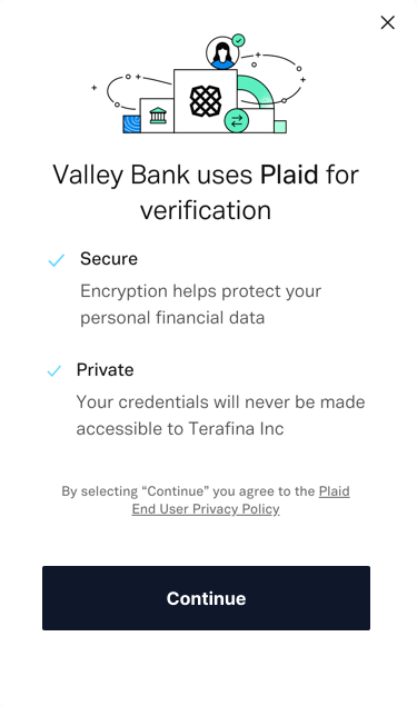
Technology integration
We redesigned the application experience to reduce friction at two critical conversion points: funding and identity verification.
- By integrating Plaid’s instant bank authentication, customers can securely log into their financial institution and verify account ownership in seconds. eliminating the delays and drop-off caused by micro-deposits.
- Alloy’s automated identity decisioning enables real-time KYC checks, allowing financial institutions to approve legitimate users faster while preventing fraud.
Together, these solutions convert previously manual checkpoints into seamless digital flows, allowing more customers to complete onboarding in minutes, not days.

The team
This work was made possible by building a 0→1 design team and incredible cross-functional partners
.jpeg)
The team
Hadassah Damien, Design Strategist
Ivy Chen, Design Operations
Caroline Phillips, Product Designer
Brandon Mosley, Product Designer
Michelle Ammiratti, UX Researcher
Joel Rosado, UX Researcher
Laura Cochran, Design Director (Player/Coach)
Let's Work Together
