Making Help Easier to Find: Information Architecture for California’s Recovery Site
This case study outlines how our team improved the findability and discoverability of content on the California Wildfire Recovery Website. We pinpointed where users encountered difficulties using IA and UI-focused user research. Then, we reorganized the content and labeled the new content sections to align more closely with their mental models. Finally, we redesigned the homepage and secondary pages.
Impact
Role
Company Name
Timeline
Opportunity
LA Wildfire survivors couldn’t easily find the vital recovery information they needed
We took a three-step approach to improve how the California Disaster Recovery Website was organized in order to improve the usability of the site.
Validating the Current Structure
- We assessed whether the existing navigation system aligned with how users would organize items.
- We examined what groupings were most important to site users.
Identifying Gaps or Issues
- We identified items that users struggled to categorize or that didn’t fit well into existing groupings.
- We surfaced labels or terms that had caused confusion or inconsistency in understanding.
Enhancing the User Experience
- We uncovered surprising patterns in how users organized information, which informed opportunities to improve the overall experience.
- We designed a new navigation system then validated it met user expectations.
Challenges
The context and impact of the work on survivors demanded care and thoughtful execution
Research activities began while individuals were still coping with shock, displacement, and uncertainty.
We prioritized trauma-informed approaches that emphasized safety, dignity, and choice, understanding that survivors needed time and stability before participating in studies that could potentially reopen emotional wounds or add cognitive burdens.
Engaging survivors in research immediately after a disaster can risk retraumatization and compromise ethical standards of care.
Our team utilized a third-party research panel that screened individuals who had applied for FEMA disaster assistance in the past. However, we did not directly recruit participants from the 2025 LA wildfire community.
Stakeholders were debating a topic-based or journey-based navigation approach.
There was a promising hypothesis that was being considered: a journey-based site structure would make information easier to find.
Findings from a keyword search analysis, page feedback, and conducting talk-aloud card sorts were triangulated to test whether a journey-based or topic-based approach made sense.
Among the open card sort research participants, only one out of twenty adopted journey-based labels and groups. The majority opted for topic-based labels and groups instead. For instance, participants tended to label groups using themes such as “Food & Shelter” rather than using a journey-oriented label like “Immediate Recovery.”
Research and Insights
Vague labels like “Get help online” left participants guessing instead of navigating with confidence
We first needed to identify gaps in the current structure
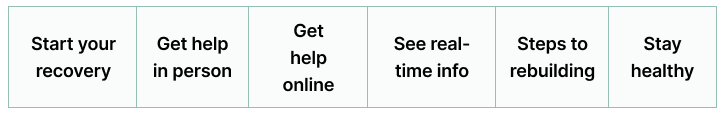
Existing homepage
Content audit
We performed a content audit to identify what information was on the site and how it was currently organized.
- Narrowed the site’s content to 37 key topics
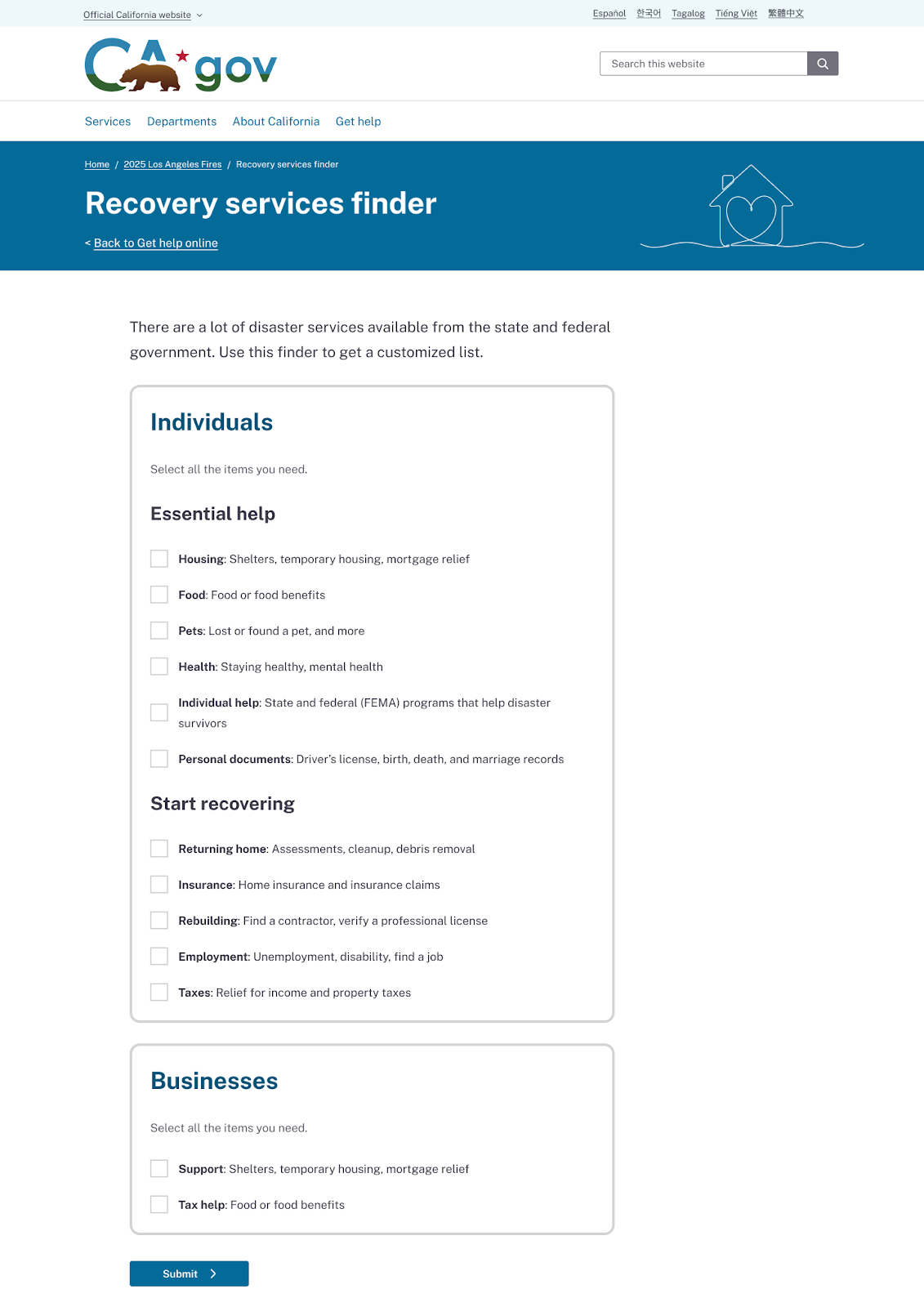
- Defined six existing categories: Start your recovery, Get help in person, Get help online, See real-time info, Steps to rebuilding, Stay healthy
Baselining with a closed card sort
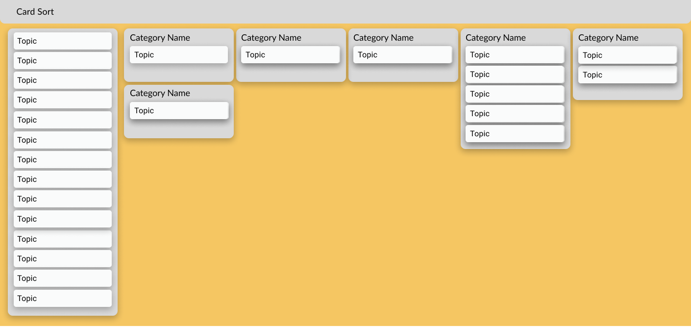
We asked 15 individuals—each of whom had recently experienced a major life transition (e.g., medical diagnosis, job loss, housing change) to sort the 37 topics into the six existing categories.
What we learned
- Participants struggled with vague or overlapping labels like “Get help online” and “Start your recovery.”
- 13 out of 37 topics (35.14%) were placed in four or more categories.
- Only 2 topics (5.41%) were consistently grouped by participants.
The initial newly defined categories, like the existing ones, were too broad and unclear.
Generating Labels with an Open Card Sort
To uncover more intuitive groupings, we conducted an open card sort with 20 new participants. They were asked to group the same 37 topics in ways that made sense to them and to name each group.
What we learned
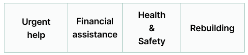
Some of the new categories were still too broad or unclear. For example, the meaning of “Urgent Help” varied widely depending on each person’s situation and priorities.
Iterating on the categories and labels
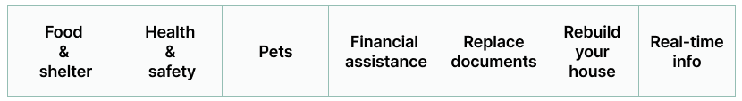
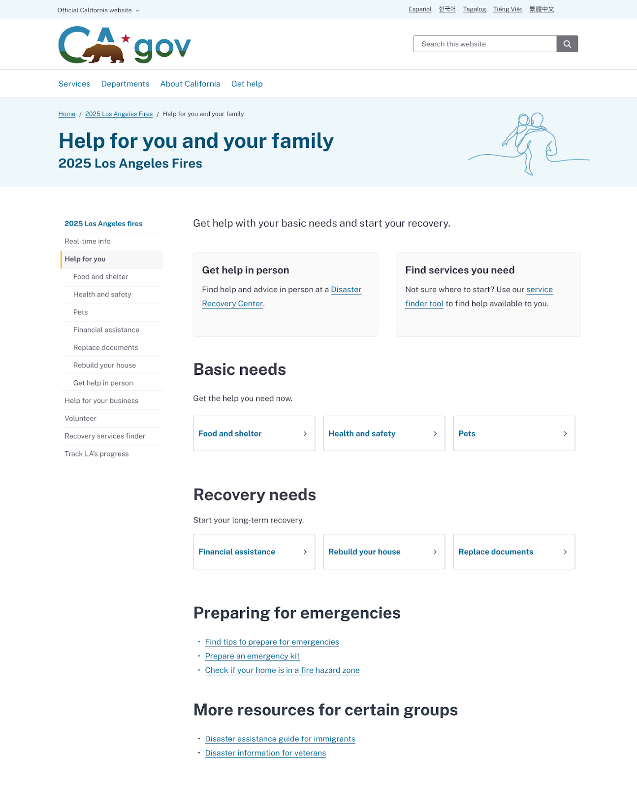
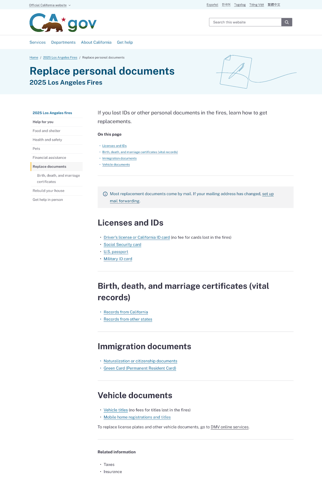
We refined the initial categories to make them more specific and easier to understand. The final category set included: Food & shelter, Health & safety, Pets, Financial assistance, Replace documents, Rebuild your house, and Real-time updates.
Solution Overview
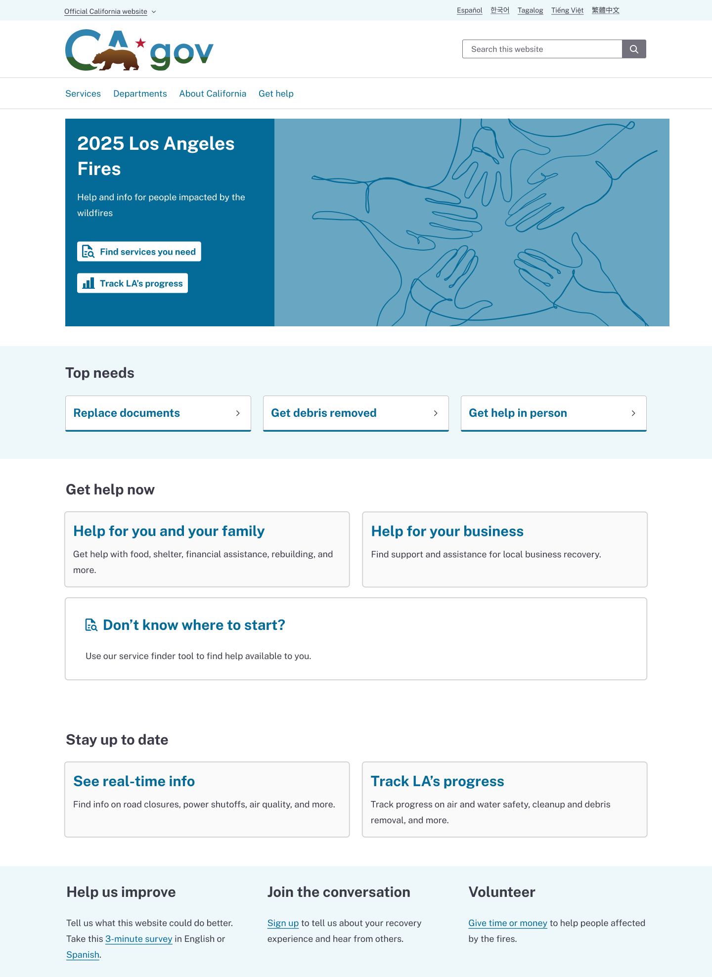
The new topic-based navigation system reduces confusion and builds trust, and helps users quickly find what they need.
Simplified IA and specific, user-centered categories and section labels
This work underscores the value of designing navigation systems around the real experiences of users, especially those navigating stress, uncertainty, or transition. By listening to how people naturally group and label information, we moved from vague, catch-all categories to a structure that reflects users’ actual needs and mental models.
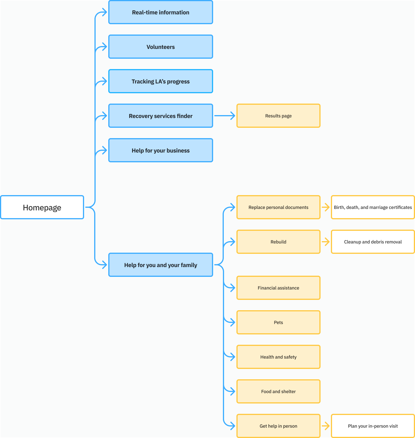
Site IA
Homepage and subpage module update
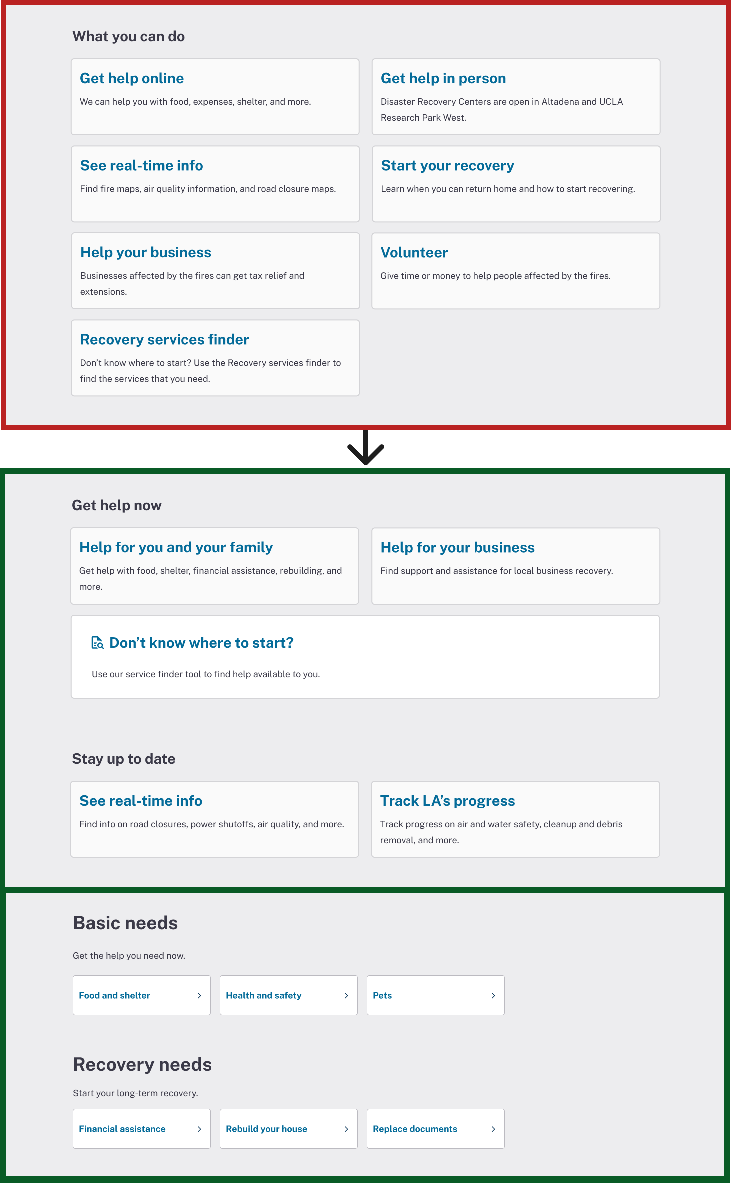
Added a "Top needs" module on the homepage to highlight time-sensitive needs
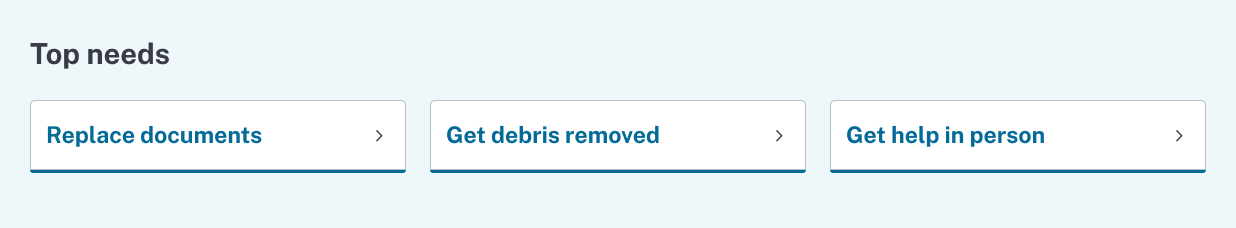
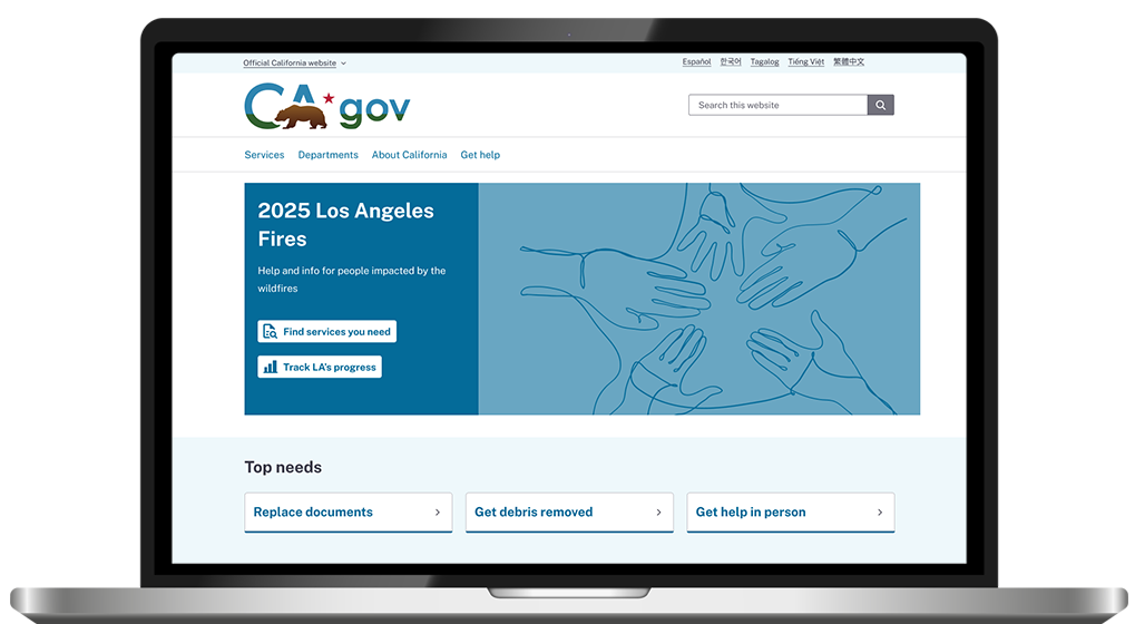
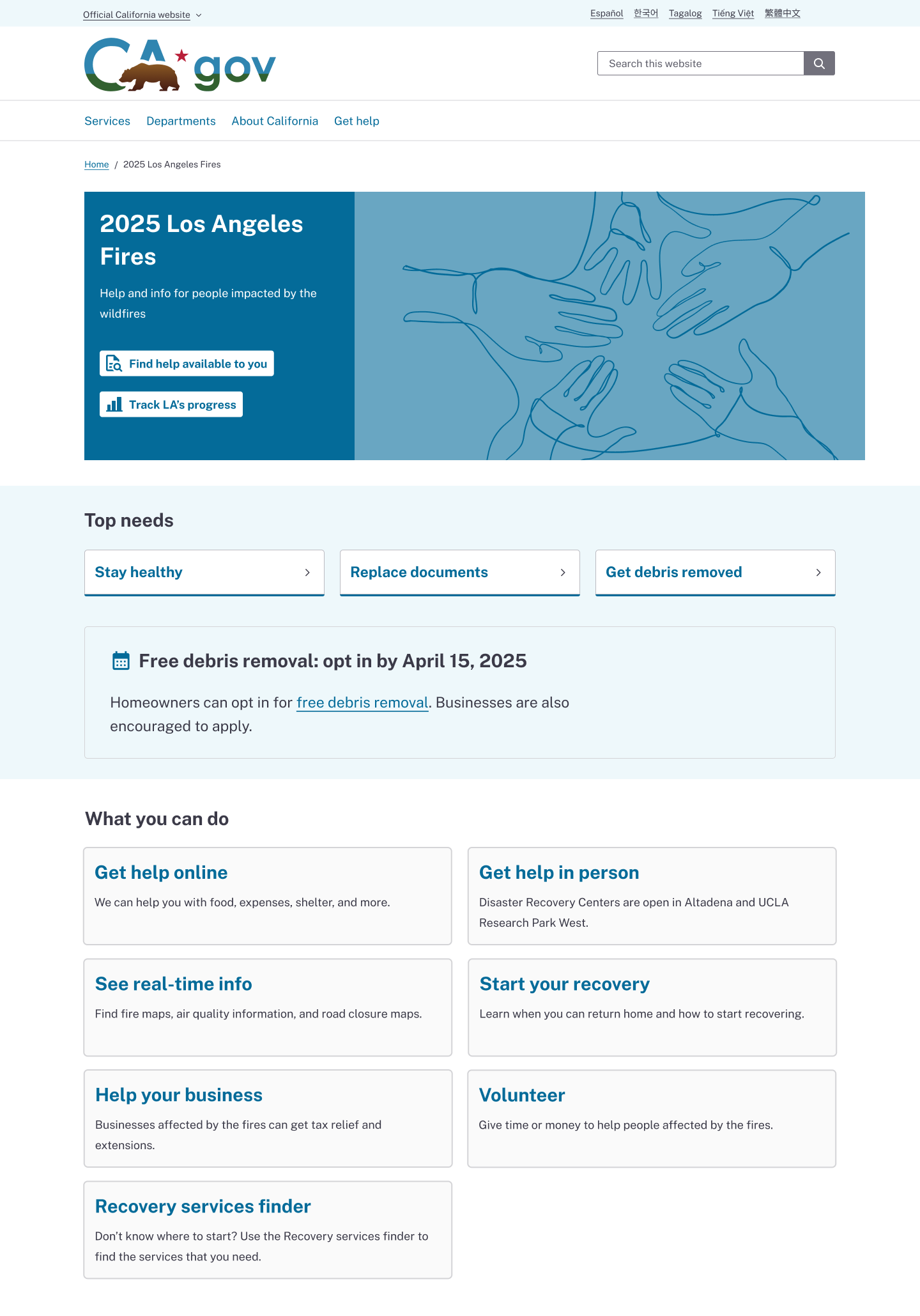
The big picture: updated homepage and subpages including an updated left navigation
Homepage
Subpage
Subpage
Updated recovery services finder

The team
The team’s collaboration, contributions and partnership was everything on this project
Delivery team
Christina Florente: Lead UX Designer
Peggy Gartin: Content Strategy
My role: Lead UX Researcher
Let's Work Together
