When life gets hard, finding help online shouldn't be
If sidewalks don’t follow the shortest path, people make their own trails through the grass. Good website design works the same way , it follows the paths people naturally want to take.
Improving how a website is organized helps people find what they need without frustration. When navigation is clear, visitors can move through the site with ease and confidence.
We see this in real life too. If sidewalks don’t follow the shortest path, people make their own trails through the grass. Good website design works the same way , it follows the paths people naturally want to take.
In this case study, we share how our team used real user data to improve a public service website. We started by identifying where people were getting stuck, then restructured the content to better match their mental models.
If you’re working on a service-oriented website that supports people during stressful or complex life moments this case study may inspire you to rethink how your content is organized. Small shifts in structure can lead to big improvements in clarity, trust, and usability.
Note: This case study has been anonymized to protect the identity of the original client. AI was used to adapt the language and context while preserving the integrity of the research. To the team: your collaboration, contributions and partnership was everything on this project. Thank you 🙌🏽
🔍 Phase 1: Identifying Gaps in the Current Structure
Step 1: Content Audit
We began by taking a close look at everything on the site to understand what information was there and how it was organized. Our process included:
- Listing every page and piece of content on the site
- Reviewing each item to see if it was useful, accurate, and up to date
- Narrowing the focus to 37 key topics that matter most to users
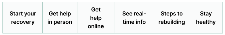
- Identifying the main sections of the site, which included: Start your recovery, Get help in person, Get help online, See real-time info, Steps to rebuilding, and Stay healthy. These were the six existing navigation sections.
Step 2: Baselining with a Closed Card Sort
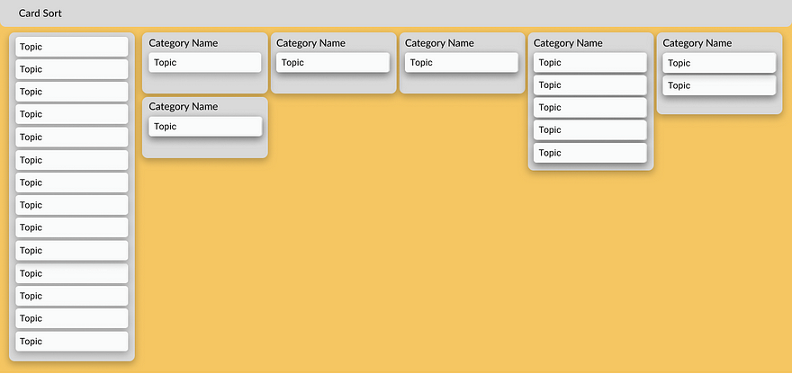
We asked 15 individuals each of whom had recently experienced a major life transition (e.g., medical diagnosis, job loss, housing change) to sort the 37 topics into the six main sections of the site.
What We Learned:
- Participants struggled to understand or choose between vague or overlapping sections like “Get help online” and “Start your recovery.”
- 13 out of 37 topics (35.14%) were placed across four or more of the sections.
- Only 2 topics (5.41%) were consistently placed in the same section by participants.
How We Responded:
We created a plan to learn how users naturally group information and what section labels they find clear and intuitive for navigation.
📊 Visualizing the Problem
We used two tools to understand the closed card sort results: a standardization grid and a dendrogram.
Standardization Grid: Topic Outliers
Standardization grids show how consistently participants placed each topic into a section. If a topic was placed in many different sections, it means people didn’t agree on where it belongs. These topics are called “outliers.”
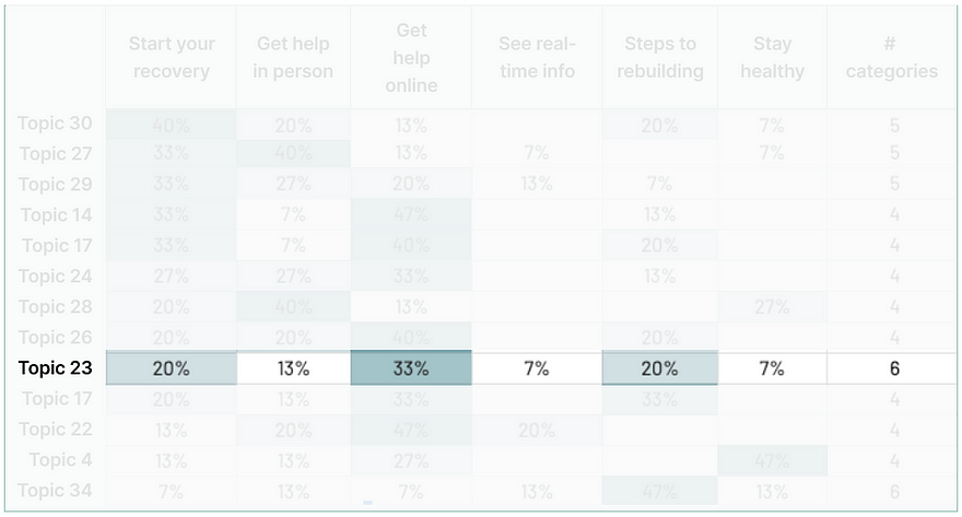
For example, participants said they would find Topic 23 — “housing” in all six sections. The most common choice, “Get help online,” was selected by only 33% of users. That’s far below the 65% agreement level typically used to show that a label or section clearly matches user expectations.
This pattern wasn’t unique. Only two topics were consistently placed, and over a third were placed in four or more categories. This highlights widespread confusion.
Dendrogram: Visualizing Disagreement
Standardization grids help us understand where people expect to find information. Dendrograms help us understand what information people expect to find grouped together or in the same section.
In our baseline dendrogram:
- Long branches indicated low agreement — participants had very different ideas about where topics belonged.
- A large red color block of topics showed that while some topics were loosely grouped together, the groupings weren’t consistent across users.
- Many of the same topics in the red block also appeared as outliers in the standardization grid.
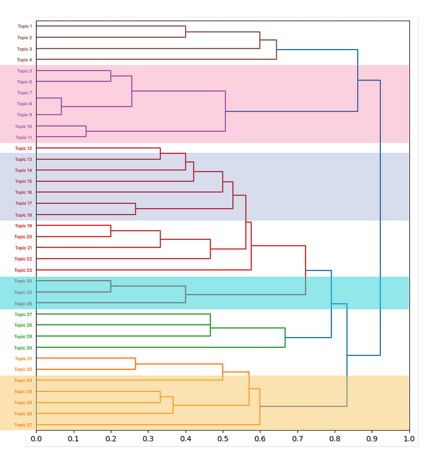
Together, these tools confirmed that the site’s structure didn’t match how users think.
📈 Signals from Behavioral Analytics
In parallel, we reviewed behavioral analytics to identify where users were dropping off or circling back — signals that they couldn’t find what they needed.
We also monitored the engagement rate and page views on important category pages. If pages have low interaction levels, this could indicate irrelevant content or a difficult navigation structure.
These insights helped us prioritize which content areas to focus on in the redesign.
🧠 Phase 2: Enhancing the User Experience
Step 1: Generating Labels with an Open Card Sort
To uncover more intuitive ways of organizing the content, we ran an open card sort with 20 new participants each of whom had recently experienced a major life transition. They were asked to group the same 37 topics in ways that made sense to them and to give each group a label that described what it contained.
What We Learned:
- Participants created 144 groups and gave each one a label. Some of these participant-generated labels matched the existing site section names.
- Entirely new groupings emerged that helped more intuitively organize the topics that surfaced as outliers in the baseline findings.
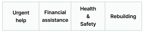
How We Responded:
We defined four user-centered navigation sections based on how participants grouped and labeled the topics: Urgent Help, Financial Assistance, Health & Safety, and Rebuilding.
These three steps were taken to identify the four sections:
- Data Cleanup: Spellings, Capitalizations and Word Tenses
- Dendrogram: Visualizing New Groupings
- Affinity Mapping: Synthesizing Labels of Similar Groupings
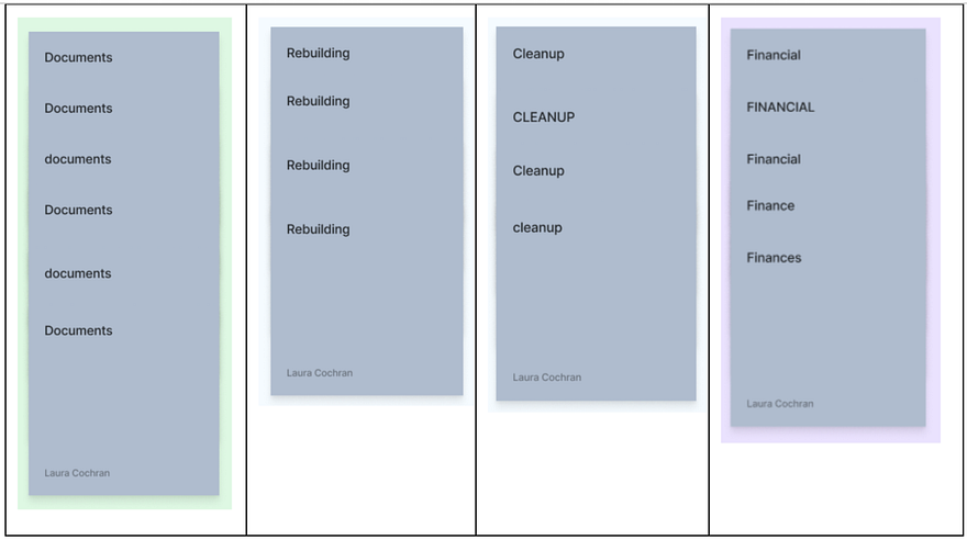
Data Cleanup: Spellings, Capitalizations and Word Tenses
The first step in organizing the 144 user-generated labels was to standardize similar group names — combining those that differed only in spelling, capitalization, or word tense. This reduced the number of unique groups from 144 to about 100. (Examples shown here are illustrative, not exhaustive.)
Dendrogram: Visualizing New Groupings
The open card sort dendrogram showed what cards were most often grouped together and how those groups of cards were connected to the bigger picture.
Affinity Mapping: Synthesizing Labels of Similar Groupings
Similar labels were grouped and synthesized to reflect shared meaning.
Example: Financial Assistance
Participants used a wide range of labels for financial topics, including:
- “Employment”
- “Finance”
- “Financial assistance”
- “Basic / Financial Survival Assistance”
Despite the variation in wording, the intent was consistent — people were trying to group content related to financial stability and support.
From these steps, the four initial categories emerged: Urgent Help, Financial Assistance, Health & Safety, Rebuilding.
Step 2: Refining with a Closed Card Sort
With the new, research-informed navigation sections in hand, we ran another closed card sort.
What We Learned:
Some section labels were still unclear. For example, “Urgent Help” meant different things to different people.
How We Responded:
We refined the section labels to make them more specific and easier to understand:
- ✅ Reintroduced a “Real-time info” section for time-sensitive information
- 🏠 Added “Housing and shelter” and “Pets” to reflect common, concrete concerns
- 🧱 Updated “Rebuild” to “Rebuild your house to clarify it referred specifically to rebuilding a home or physical space — not emotional or financial recovery
- 🪪 Introduced a “Replace documents” section to help users quickly find information about replacing IDs, licenses, and other essential paperwork
Step 5: Testing Revised Categories with a Final Closed Card Sort
We then tested this revised set of navigation sections to see whether they helped users find content more easily.
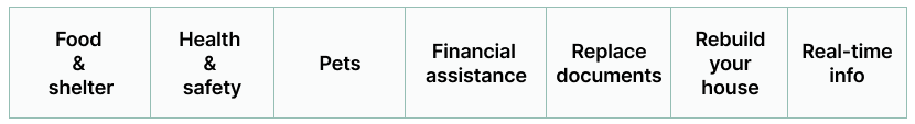
The final navigation sections were: Food & shelter, Health & safety, Pets, Financial assistance, Replace documents, Rebuild your house, and Real-time info.
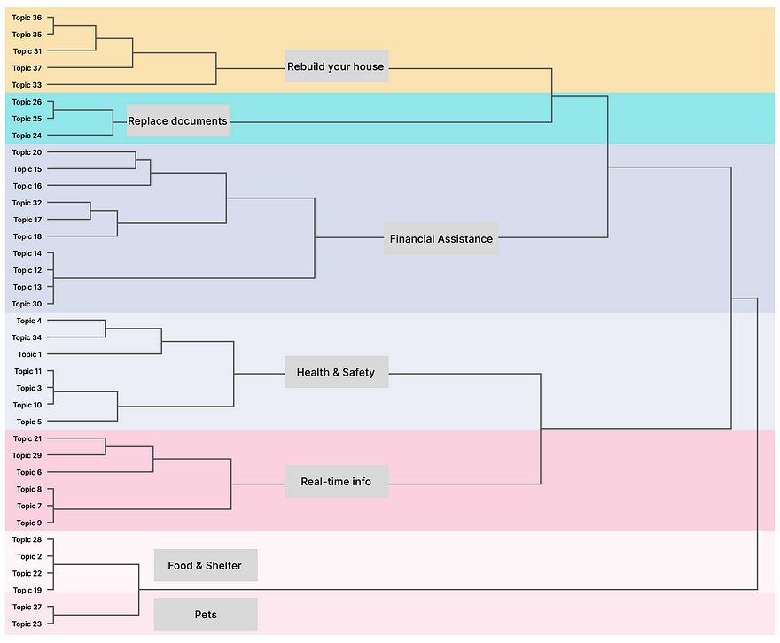
Dendrogram: Visualizing the Final Groupings
To better understand how participants grouped topics in the final card sort, we again used a dendrogram to see what topics were most often placed together.
In this final version:
- Shorter branches indicated strong agreement — participants consistently grouped certain topics under the same section.
- Clear clusters emerged, showing that the revised section labels aligned more closely with how users naturally think about the content.
This visualization confirmed what the numbers showed: the updated navigation structure made it easier for people to find and group related information.
Impact
The new navigation labels and sections made it much easier for people to find what they needed.
- In the final test, none of the topics were placed in four or more sections compared to 13 out of 37 topics (35.14%) in the original test. This means users were much more confident about where each topic belonged.
- 79% of topics were consistently grouped by participants, showing strong agreement — up from just 16% in the baseline test.
These results show that clearer labels and more intuitive sections helped users navigate the site with less confusion and more confidence.
Key Takeaways
When people are facing stressful or complex life situations, they need websites that are easy to navigate. By listening to how real users think and organize information, we created clearer navigation labels and more intuitive sections.
The result? A simpler, clearer site that helps people find what they need when they need it most.
If your website helps people during stressful times, don’t guess how it should be organized. Ask real users. Let their thinking guide your design.
Start small. Run a card sort. Try a tree test. Even one round of feedback can lead to big improvements.
When we design with people in mind, we don’t just make websites better. We make life a little easier.
Let your navigation be more than a menu. Let it be a map that helps people move forward.
Discover the Design World
Stay updated with the latest trends and insights in the design industry.
.jpeg)


